
Matplotlib is a versatile and widely-used library in Python for data visualization. With its powerful tools, you can create a wide range of visualizations, from simple line plots to complex heatmaps and 3D plots. This tutorial will guide you through the essentials of Matplotlib, its features, and practical examples to help you get started. If you are looking for a detailed Python Matplotlib tutorial, you have come to the right place.
What is Matplotlib?
Matplotlib is a popular data visualization library in Python. It provides an object-oriented API for embedding plots into applications using Python GUI toolkits such as Tkinter, PyQt, or WxPython. Whether you are creating a basic bar chart or a sophisticated 3D visualization, Matplotlib makes it easy to generate clear and compelling visual representations of data.
Why Use Matplotlib?
- Versatility: Supports various types of plots such as line, scatter, bar, histogram, and pie charts.
- Customization: Offers complete control over plot elements, including titles, labels, and styles.
- Integration: Seamlessly integrates with NumPy, Pandas, and other libraries for data manipulation.
- Interactive Features: Allows zooming, panning, and dynamic updating of plots.
Installing Matplotlib
To start using Matplotlib, you need to install it. Use the following command in your terminal:
pip install matplotlib
After installation, you can import it into your Python script:
import matplotlib.pyplot as plt
Getting Started with Matplotlib
Creating a Simple Plot
Here’s an example of a simple line plot:
import matplotlib.pyplot as plt

# Data
x = [1, 2, 3, 4, 5]
y = [10, 20, 25, 30, 35]

# Create Plot
plt.plot(x, y, label='Sample Data', color='blue', marker='o')
plt.title('Simple Line Plot')
plt.xlabel('X-axis')
plt.ylabel('Y-axis')
plt.legend()

# Show Plot
plt.show()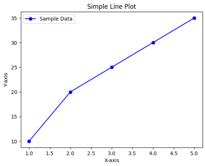
Common Types of Plots in Matplotlib
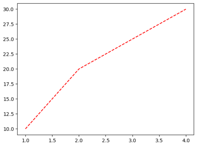
1. Line Plot
Line plots are used to show trends over time or continuous data.
plt.plot([1, 2, 3, 4], [10, 20, 25, 30], linestyle='--', color='red')
plt.show()
2. Bar Chart
Bar charts are ideal for comparing categories.
categories = ['A', 'B', 'C', 'D']
values = [10, 20, 15, 25]

plt.bar(categories, values, color='green')
plt.title('Bar Chart Example')
plt.show()
3. Histogram
Histograms represent the distribution of numerical data.
import numpy as np

data = np.random.randn(1000)
plt.hist(data, bins=30, color='purple', edgecolor='black')
plt.title('Histogram Example')
plt.show()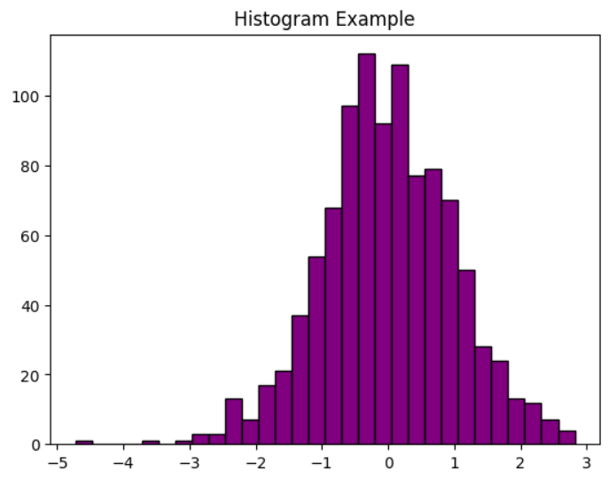
4. Scatter Plot
Scatter plots are great for identifying relationships between two variables.
x = [1, 2, 3, 4, 5]
y = [5, 15, 25, 10, 30]

plt.scatter(x, y, color='orange')
plt.title('Scatter Plot Example')
plt.show()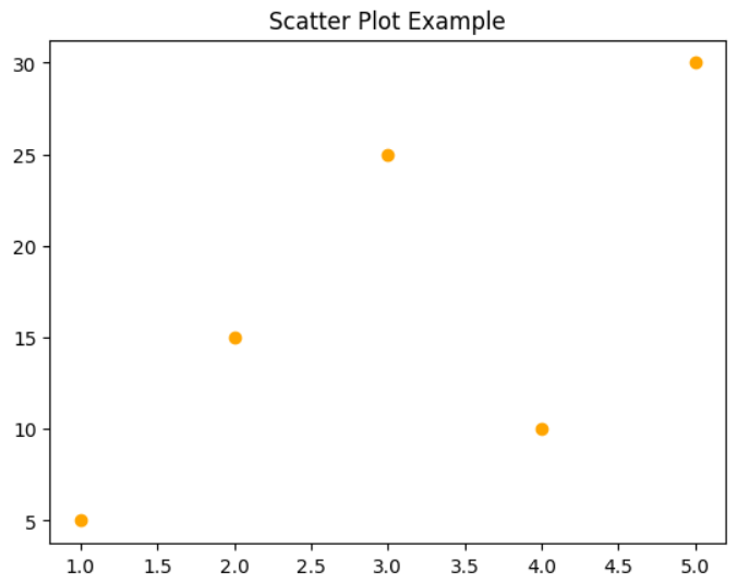
5. Pie Chart
Pie charts show proportions or percentages.
sizes = [25, 35, 20, 20]
labels = ['A', 'B', 'C', 'D']

plt.pie(sizes, labels=labels, autopct='%1.1f%%', startangle=90)
plt.title('Pie Chart Example')
plt.show()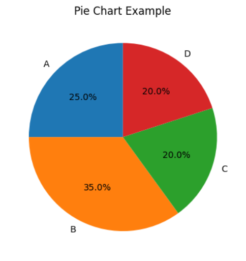
Customizing Plots
Matplotlib provides numerous ways to customize your plots. Here are some common customizations:
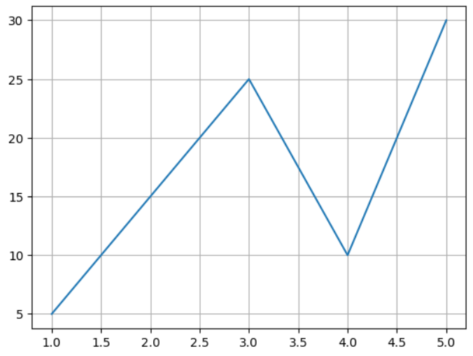
Adding Gridlines
plt.plot(x, y)
plt.grid(True)
plt.show()
Changing Figure Size
plt.figure(figsize=(10, 5))
plt.plot(x, y)
plt.show()

Saving a Plot
Save your plot as an image file:
plt.plot(x, y)
plt.savefig('plot.png', dpi=300)
all the above Program with Example click here.!
Best Practices for Using Matplotlib
- Use Clear Labels: Ensure axes and legends are properly labeled with descriptive names.
- Choose Appropriate Plot Types: Select a plot type that best represents your data.
- Optimize Layout: Use tight layouts to avoid overlapping elements.
- Combine with Other Libraries: Utilize NumPy and Pandas for data manipulation before plotting.
Advantages of Matplotlib
- Ease of Use: The simple syntax makes it beginner-friendly.
- Flexibility: Works well with small scripts as well as complex projects.
- Compatibility: Integrates with other libraries for advanced workflows.
- Rich Documentation: Offers extensive resources for troubleshooting and learning.
Conclusion
Matplotlib is a powerful tool for data visualization in Python. Whether you are a beginner or an experienced developer, mastering Matplotlib can significantly enhance your data analysis and presentation skills. Start experimenting with different plot types and customizations to unlock its full potential in your projects.
Interview questions
1.What are the main components of a Matplotlib plot? (Google)
A Matplotlib plot typically consists of the following components:
- Figure: The container for all elements of the plot.
- Axes: The area where data is plotted.
- Axis: Represents the x-axis or y-axis of the plot.
- Ticks: Marks used to show specific data points on the axes.
- Legend: Provides labels for the plotted data.
- Title: Describes the overall plot.
- Labels: Define the names for the axes.
2.What is Matplotlib, and why is it used? (IBM)
Matplotlib is a Python library for creating static, interactive, and animated visualizations. It provides a comprehensive set of tools to create various plots, such as line plots, bar charts, histograms, scatter plots, and more. The library is widely used because of its versatility, ease of use, and ability to integrate with other Python libraries like NumPy and Pandas. It helps in visualizing data effectively to identify trends, patterns, and outliers.
3.What is the difference between pyplot and axes in Matplotlib? (TCS)
pyplot: A module in Matplotlib that provides a MATLAB-like interface. It is a collection of functions for creating and customizing plots in an interactive manner. Example: plt.plot().axes: Represents a single plot or graph within a figure. It is part of the object-oriented approach, offering more control over plot customization. Example: ax.plot().
4.How does Matplotlib handle multiple plots in the same figure? (Zoho)
Matplotlib supports multiple plots within the same figure using subplots. The plt.subplot() function divides the figure into a grid layout and places individual plots in different cells. Alternatively, plt.subplots() creates a grid of Axes objects.
5.What is the purpose of tight_layout() in Matplotlib? (Meta)
The tight_layout() function adjusts the spacing between plot elements to prevent overlaps. It is especially useful when multiple subplots are present.
Lets play : Date & Time
Learn about Scipy Tutorials